The challenge was to rebrand Rogers Sports and Media to look closer to the master brand. We were tasked to use the same brand elements (colours, font and elements).
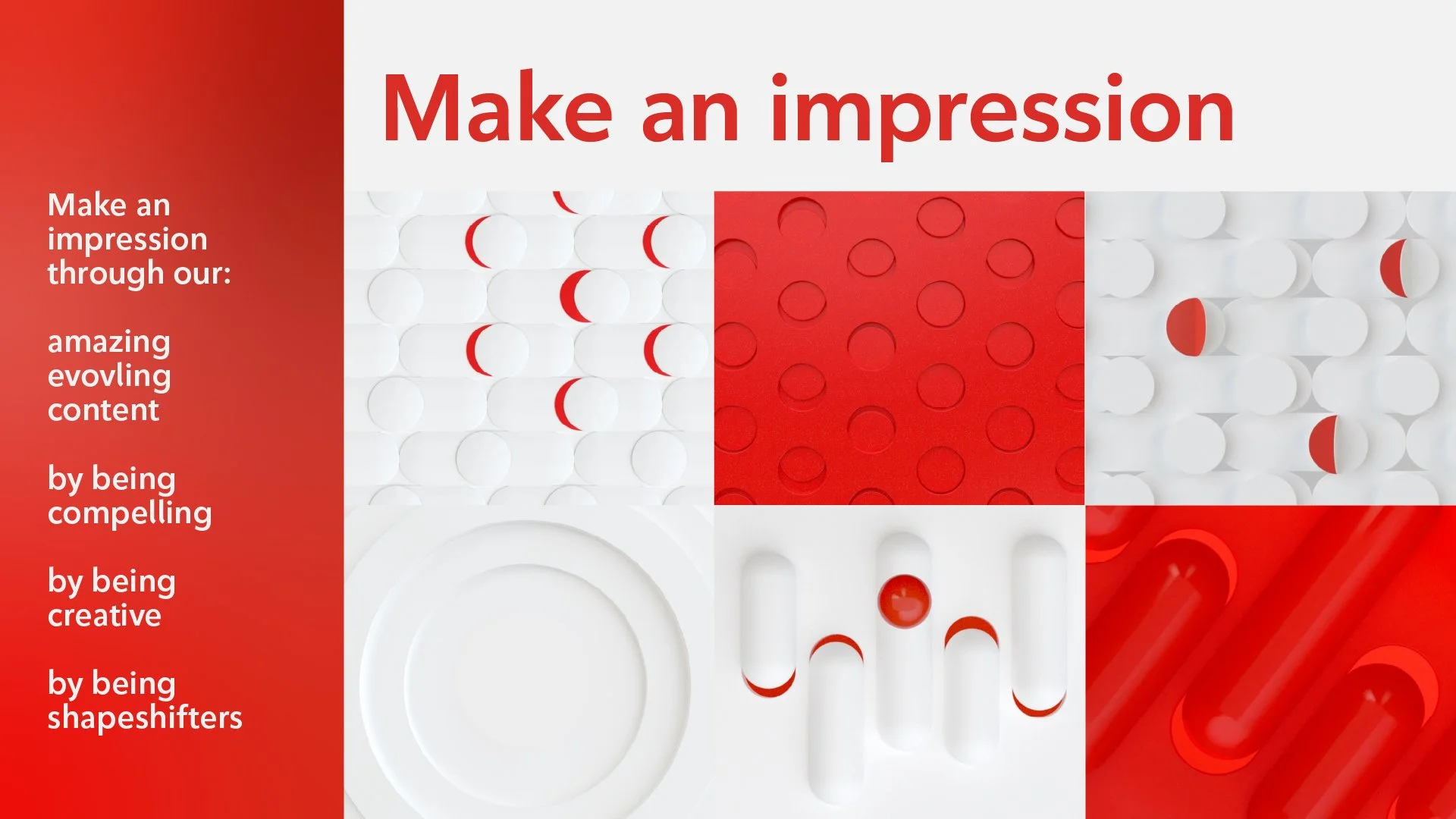
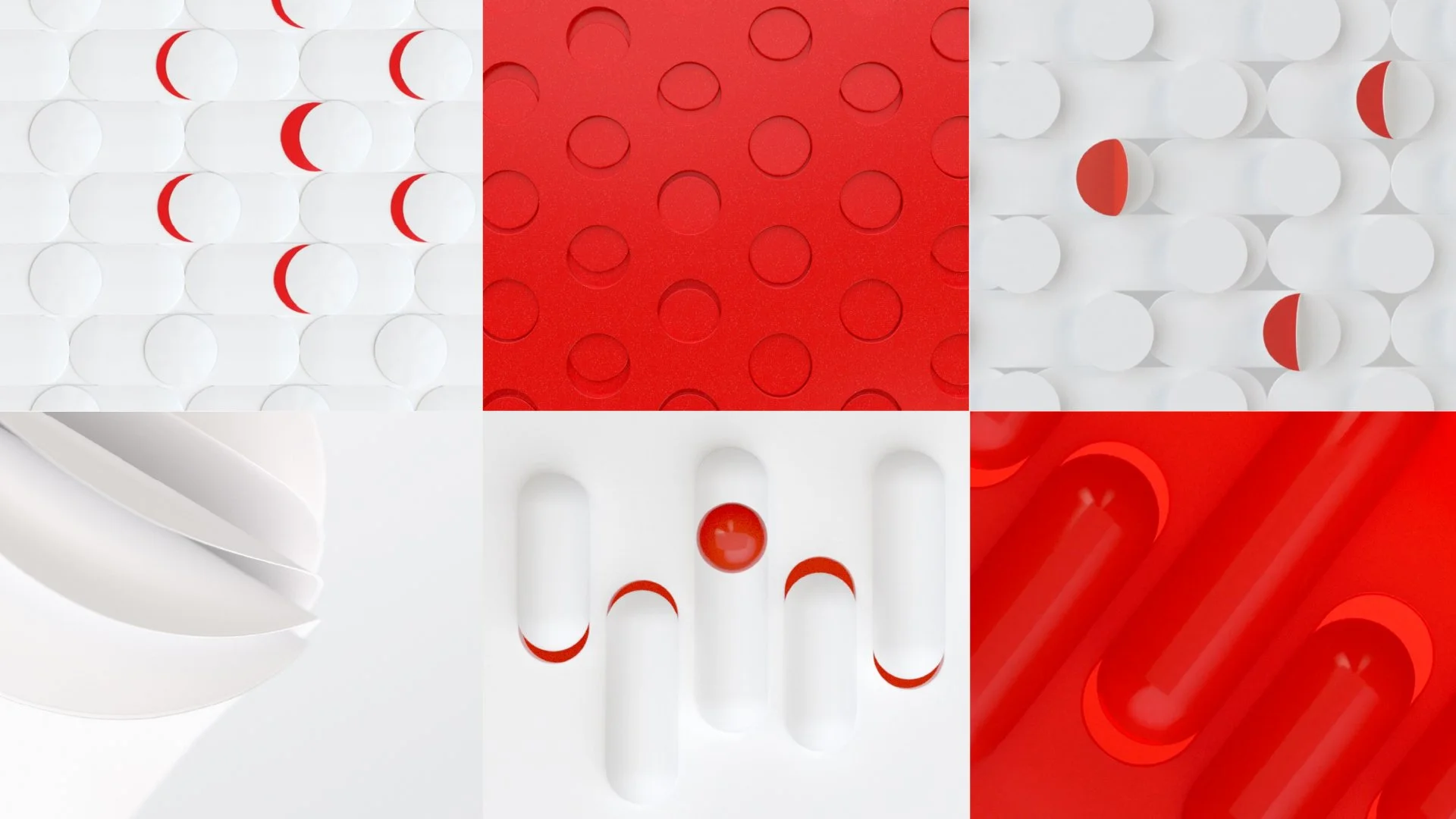
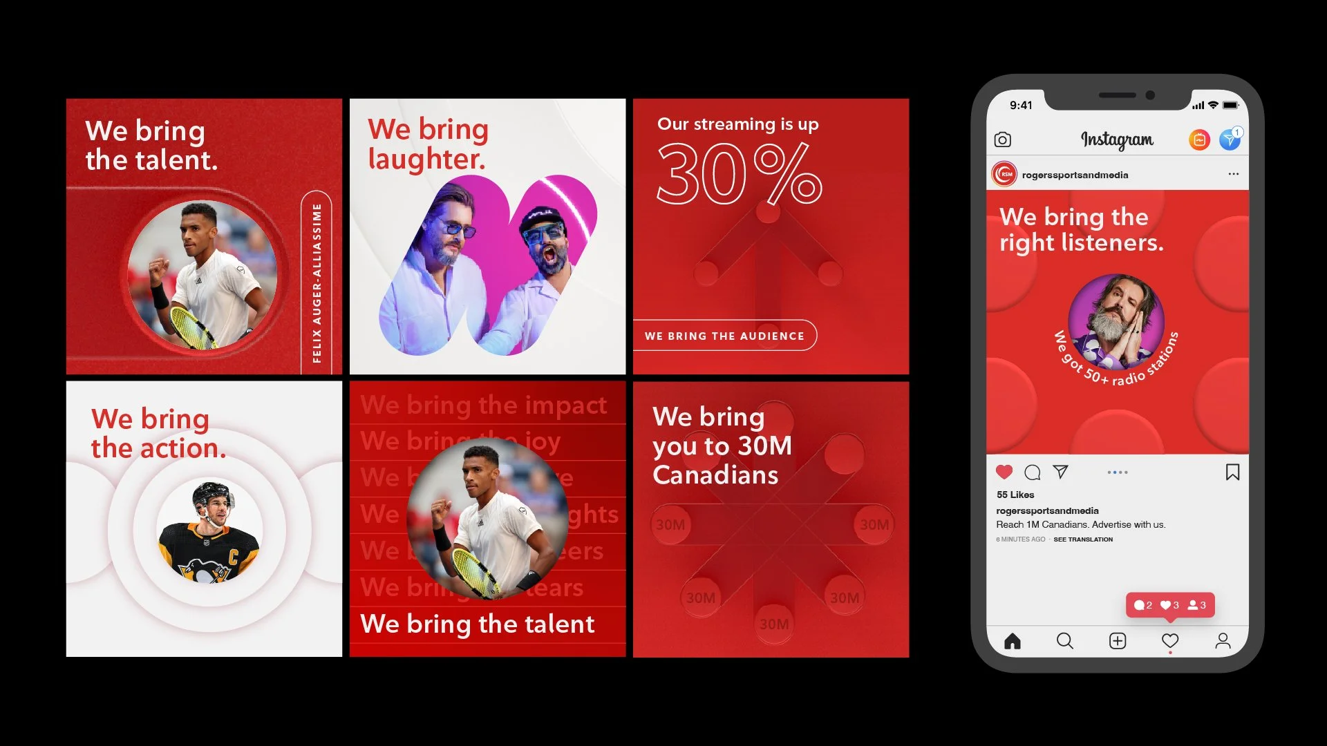
Drive impact. Make an impression.
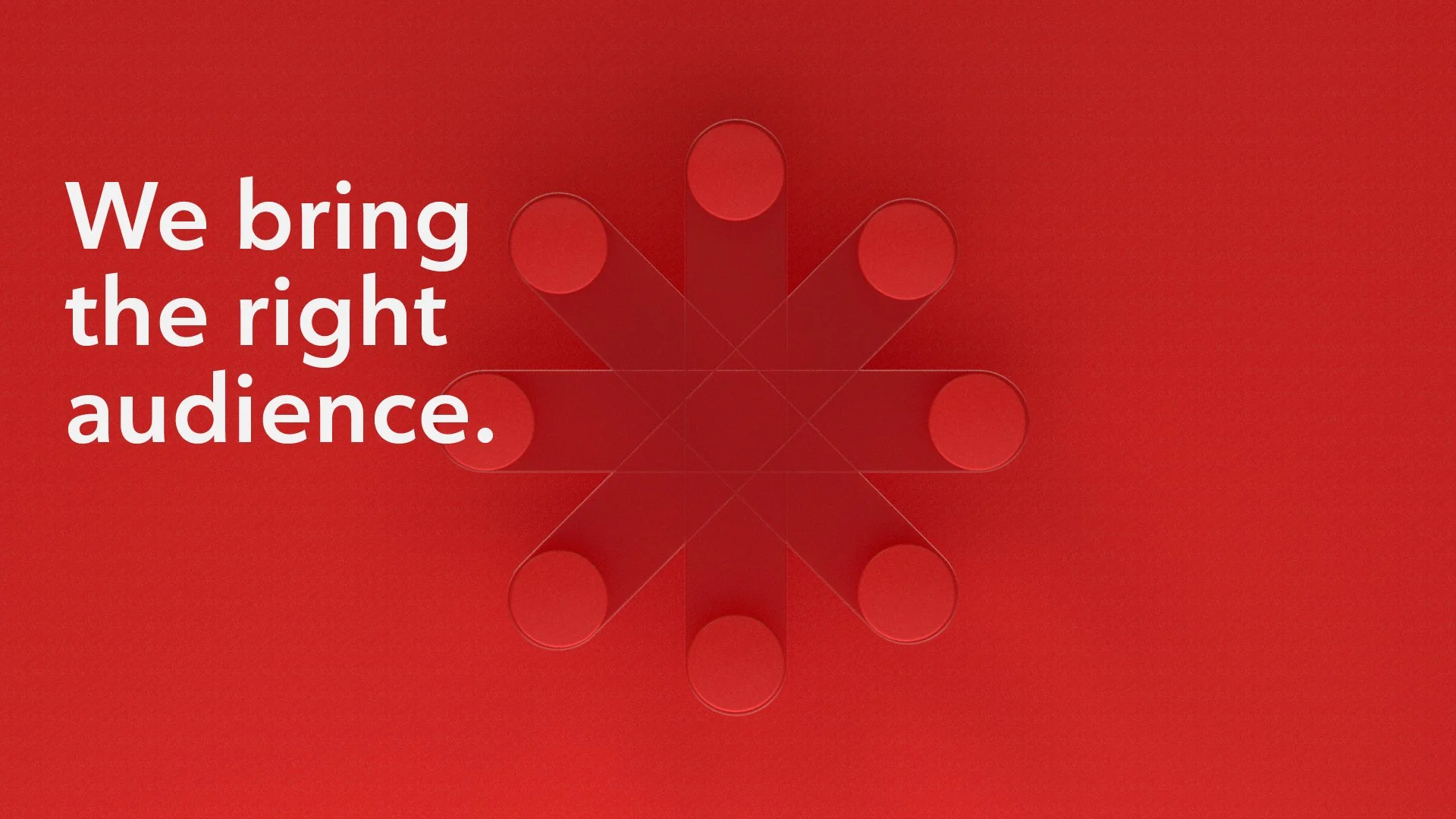
Our design solution was to use a circle as a starting point to represent our content and vision. This circle stems from the Rogers mobius shape making it all rooted in the masterbrand.
We created a visual language that is rooted in the shape of the logo to show our impact and our amazing evolving content. This circle also acts as a lens and content holder that creates a dynamic storytelling device that works across all our media platforms (video and audio). This graphic device leaves a lasting impression by taking different forms to tell various stories.
Co-designers: Alex Rosa, Oscar Patzan, Luis Luichi, Ash Edwards, Sky Lee
Design Director: Bart Sciana