Make it bold and italic.
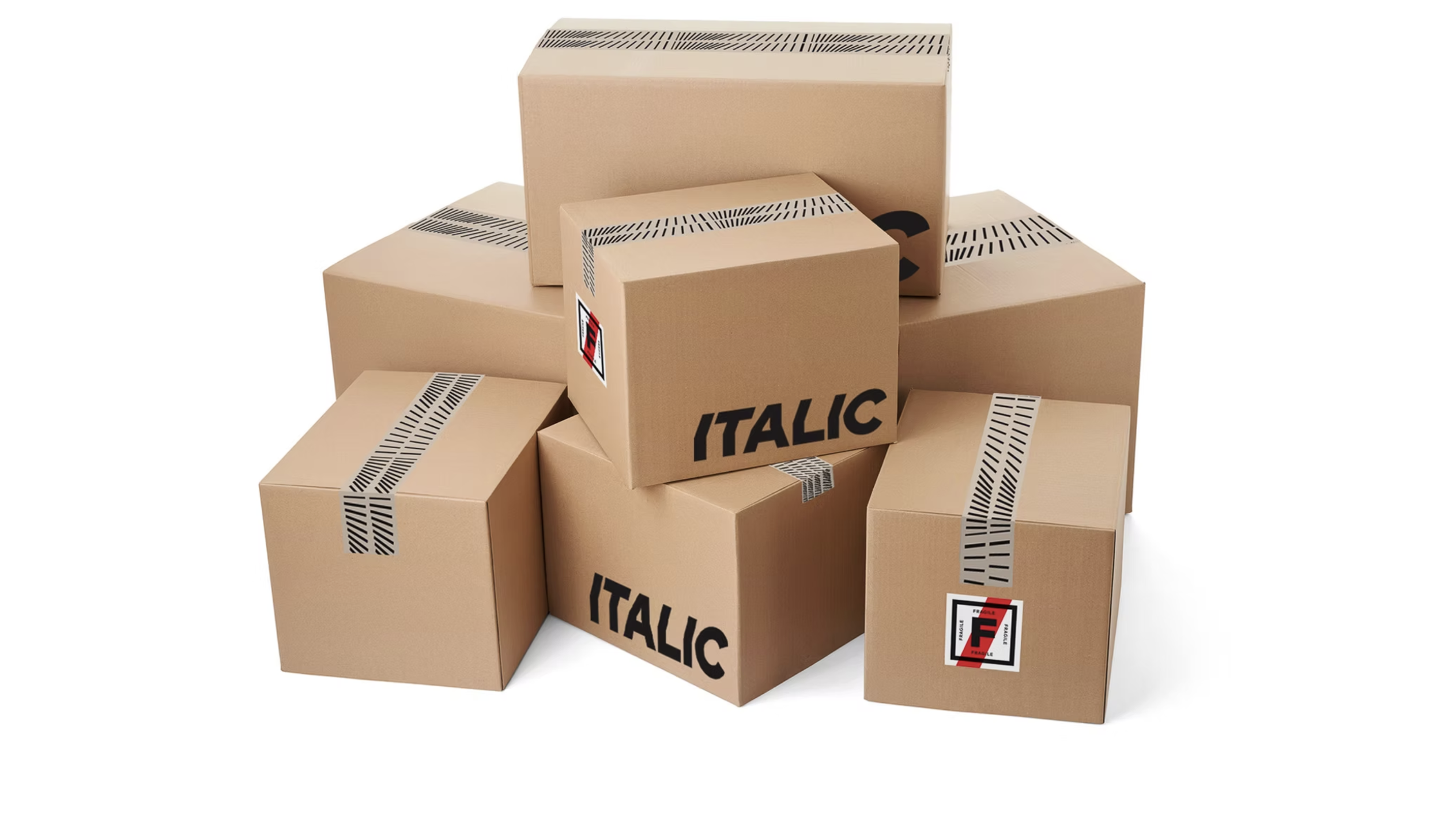
DT Print Solutions rebranded as Italic to better align with its evolving business goals and reposition itself within the marketplace. The rebrand was driven by the need for a more dynamic identity that reflected both the vibrancy of downtown Toronto and the diversity of their client base. The new brand had to be timeless, adaptable, and relevant across a range of industries—especially appealing to both designers and the broader business community.
The challenge here was balancing creative energy with professionalism, ensuring that the rebrand resonated with those in the design and creative industries, while still maintaining appeal to more corporate clients.
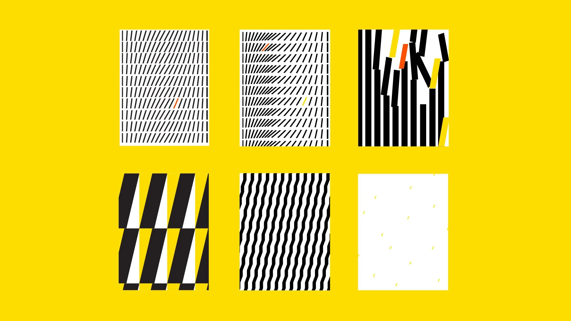
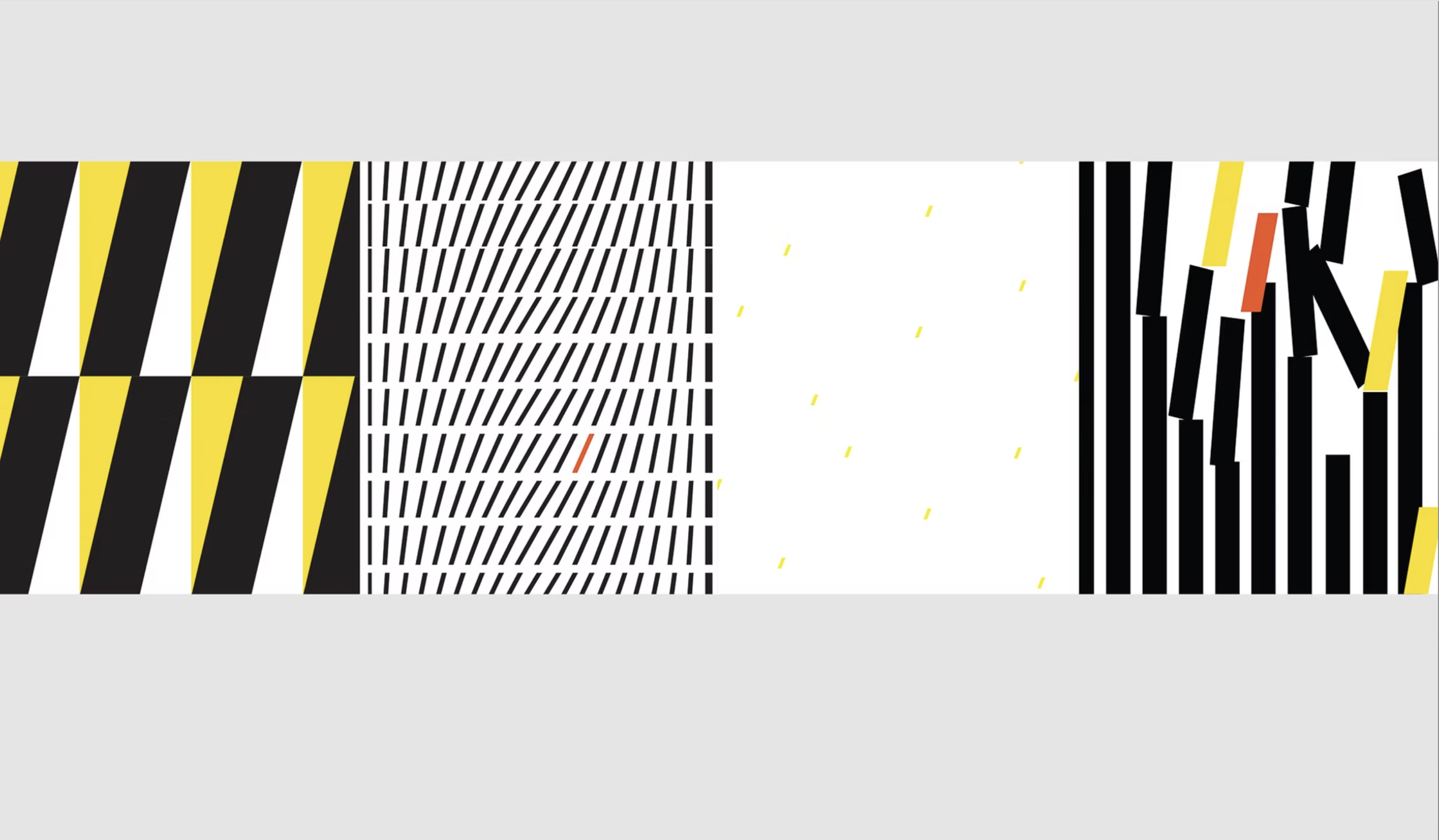
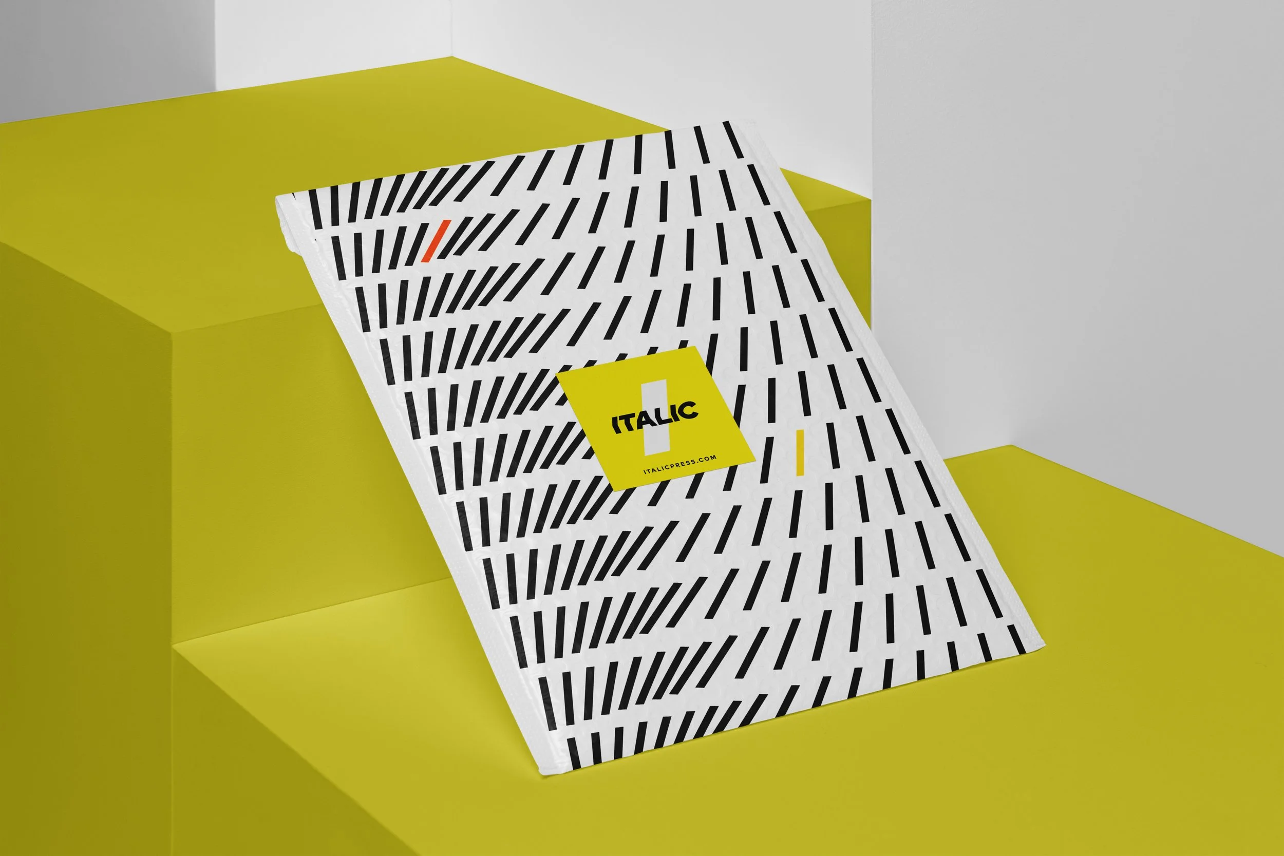
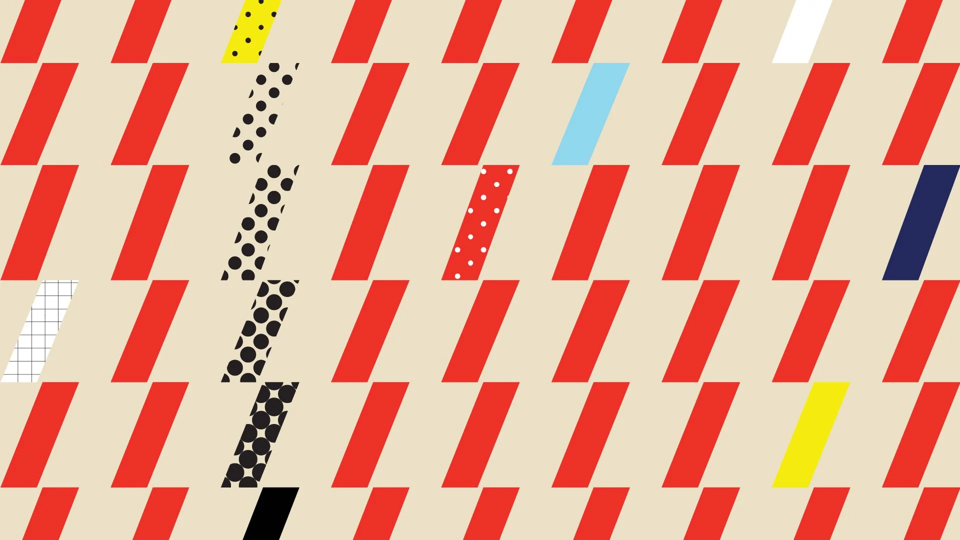
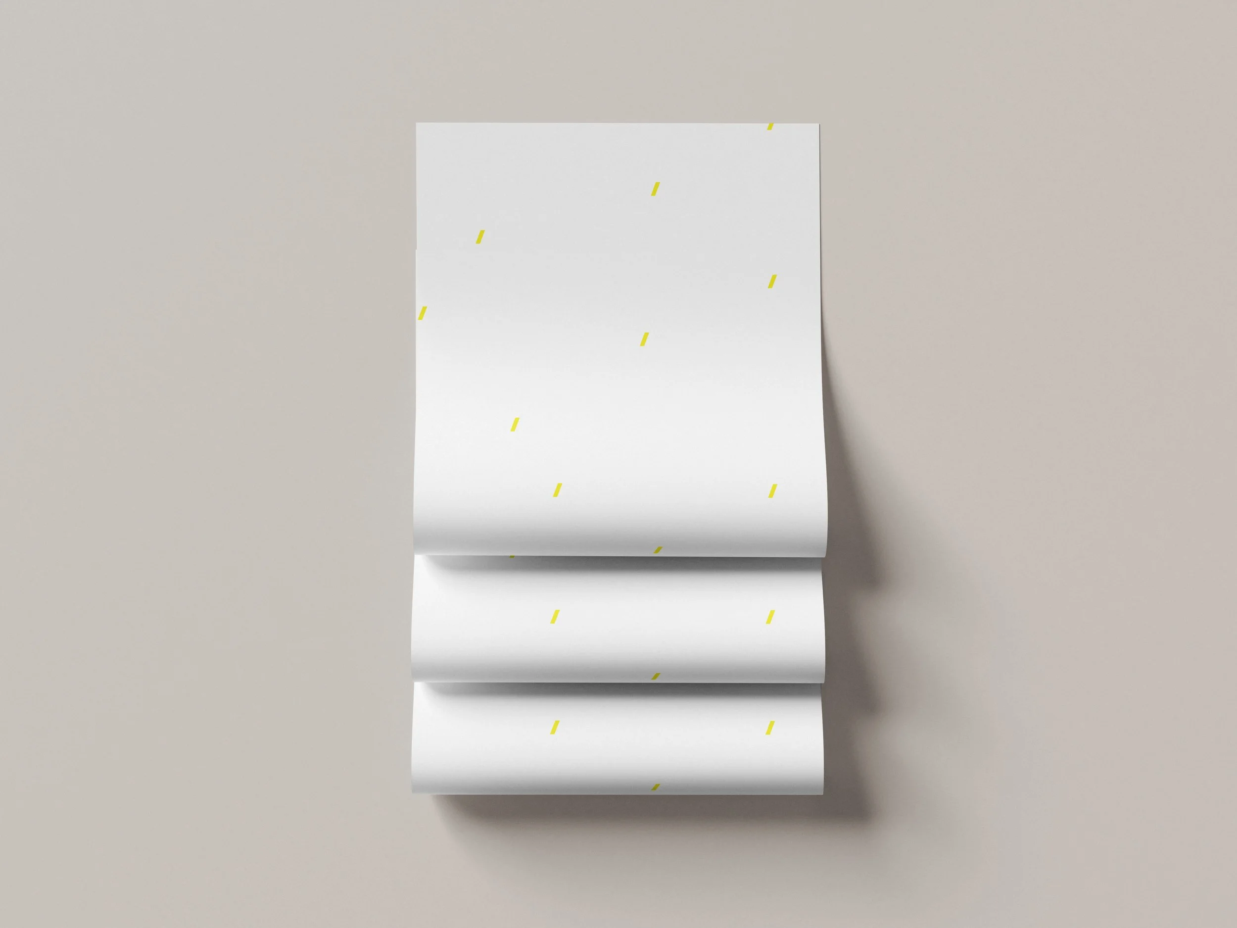
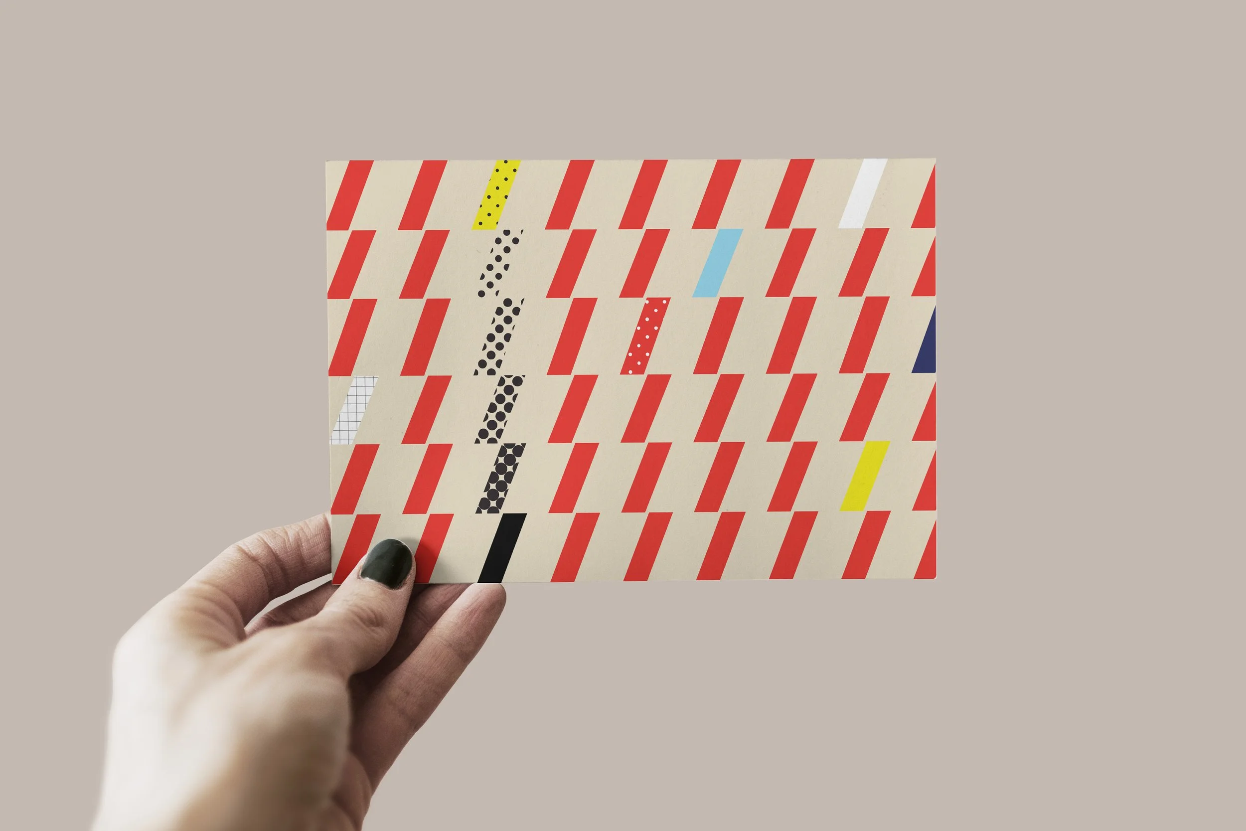
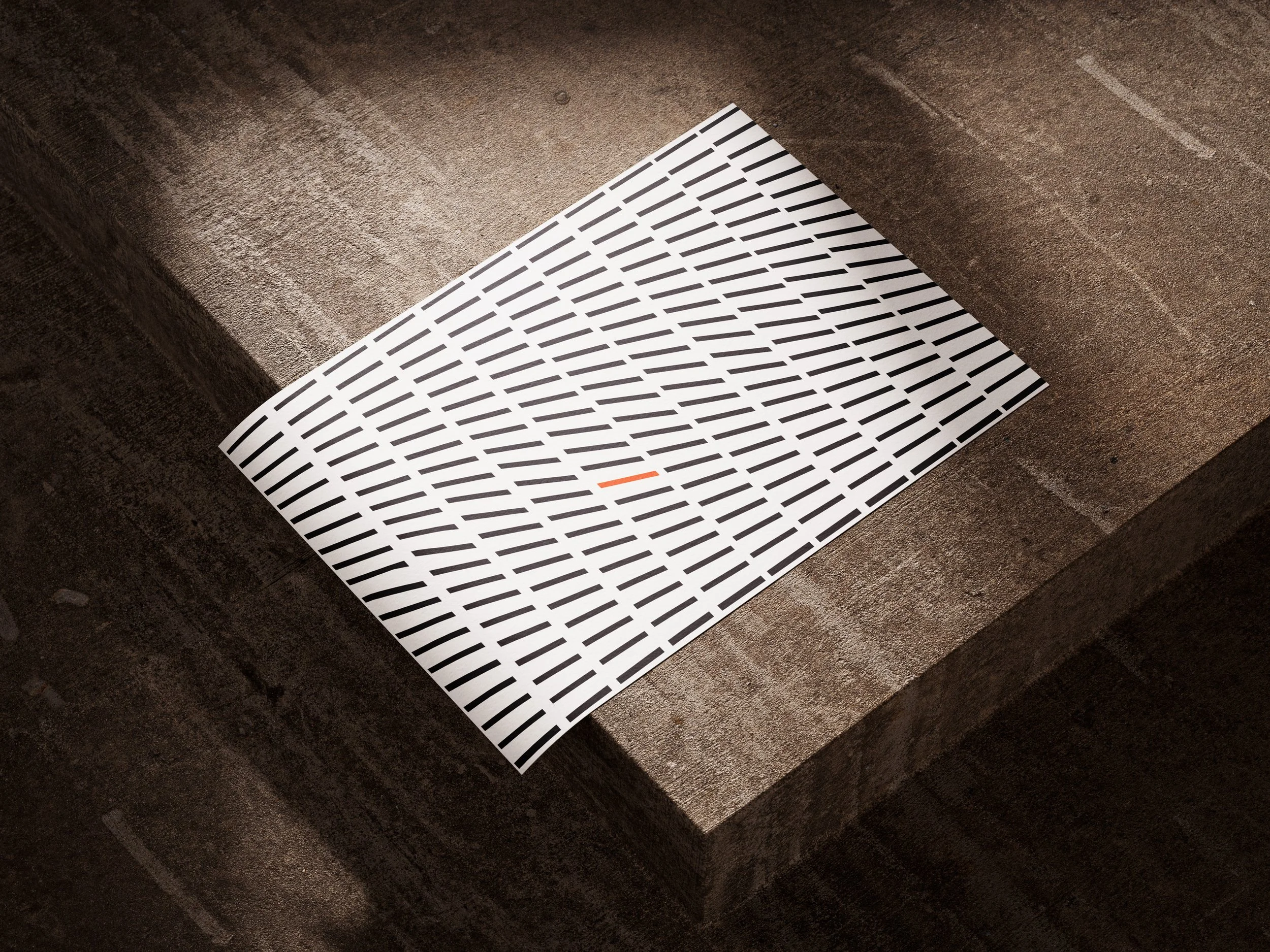
We conceptualized a simple word mark that showed movement in the printing industry. The word mark is paired with a simple slash that implies movement, energy, along with a dynamic, forward-thinking look.
The slash, in this case, isn’t just a design element—it serves as a symbol for progression, speed, and collaboration, which are core values in both design and printing. Fun patterns are made using the slash that suggests progression or speed. It also symbolizes two ideas or paths intersecting and working together, visually portraying a fusion when designers and print experts come together to create something special.
Creative director: Wilson Duong
Agency: Recess Creative