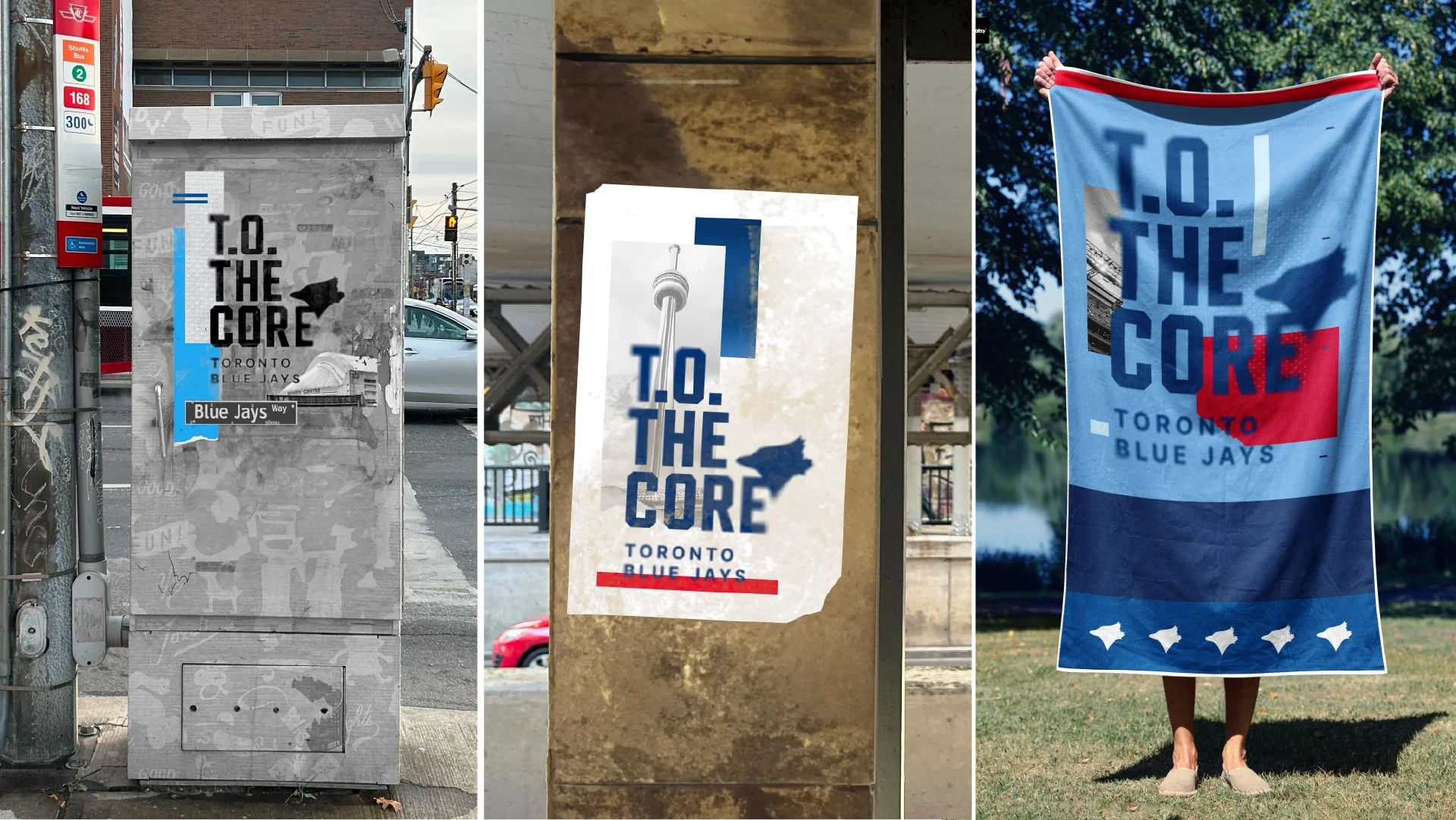
Our solution was to integrate local landmarks that represents the eclectic spirit of Toronto to make the campaign and tagline connect and stand out.
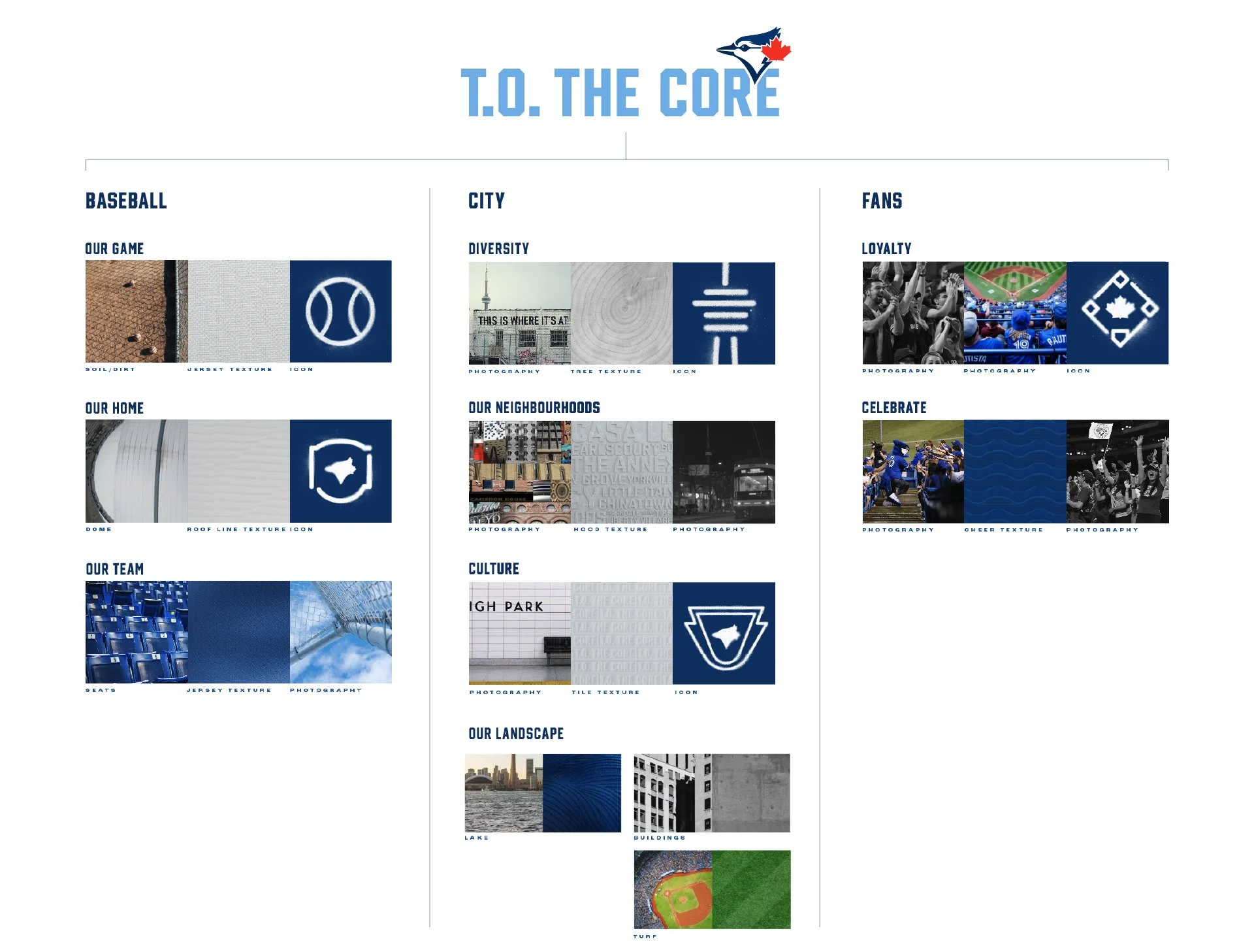
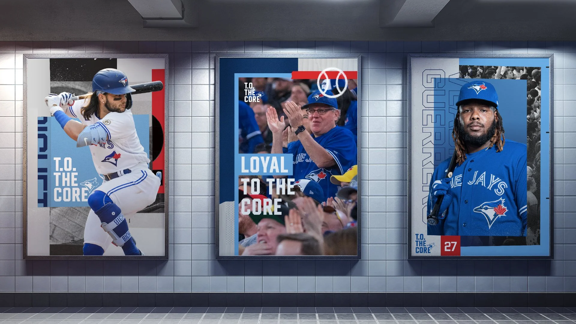
We made a simple word mark that can be used with a variety of textures and images that highlight Blue Jays as the core of the city. This dynamic mark gives the campaign the legs it needs to last for years.
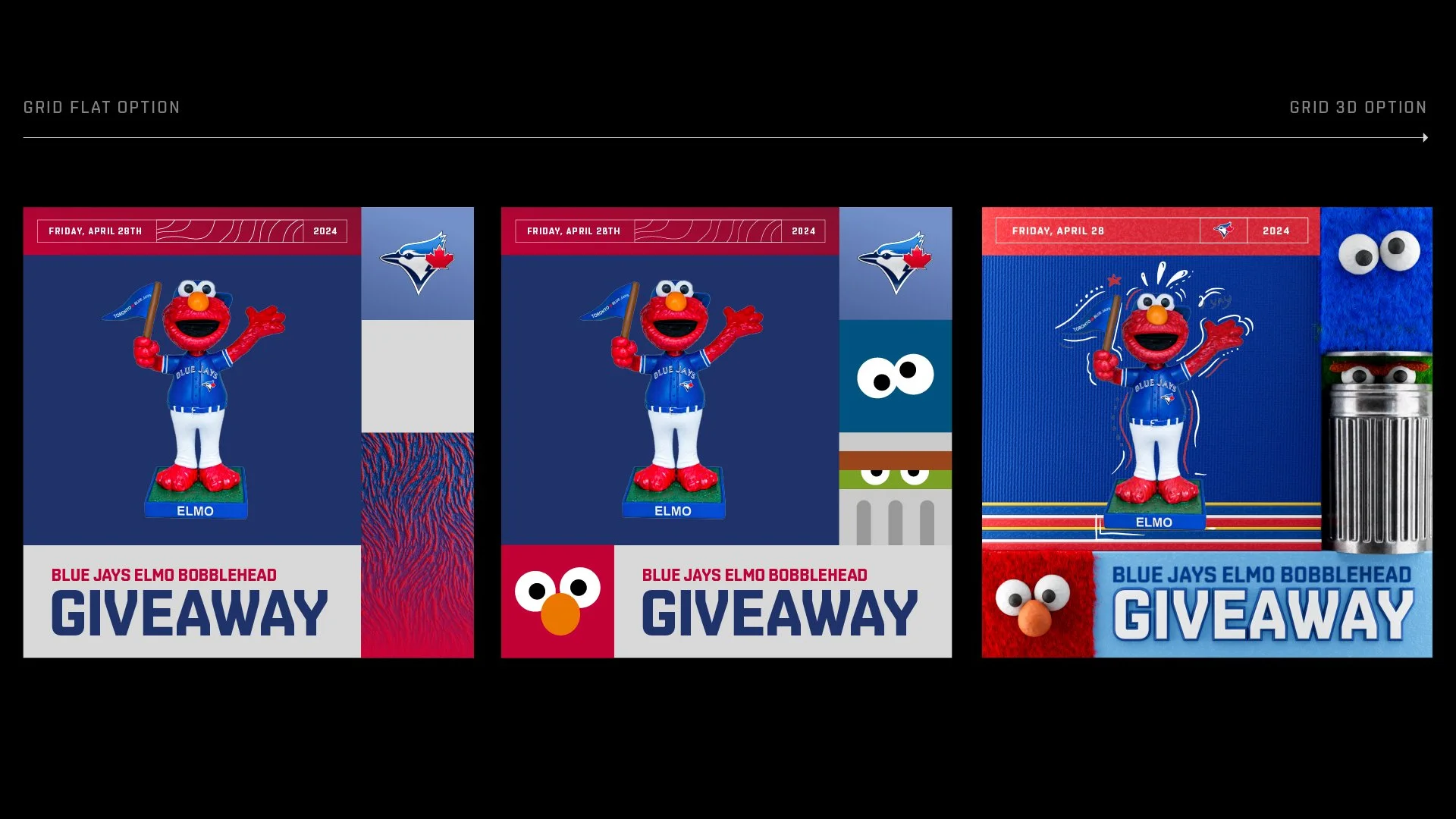
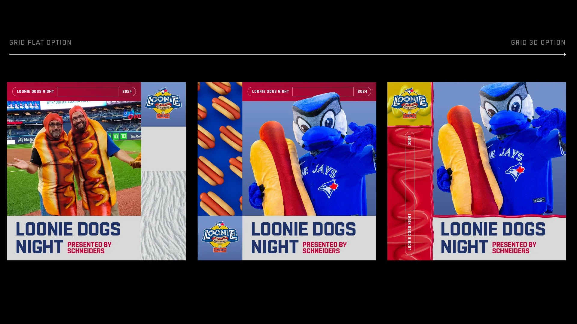
For the look and feel system we created a dynamic grid system that can be used in several ways giving the internal design team a toolkit that would create design solutions that are interesting and unexpected. This graphic and pictorial solution enables multiple expressions that be either 2D or 3D depending on its use. Together, it emphasizes unity by featuring diverse fans coming together to celebrate their shared love for the team.
Co-designers: Alex Rosa, Matt Doyle, Oscar Patzan, Luis Luichi, Ash Edwards, Sky Lee
Design Director: Bart Sciana
Role: Creative director and designer
Scope: Brand campaign look and feel system for 2024